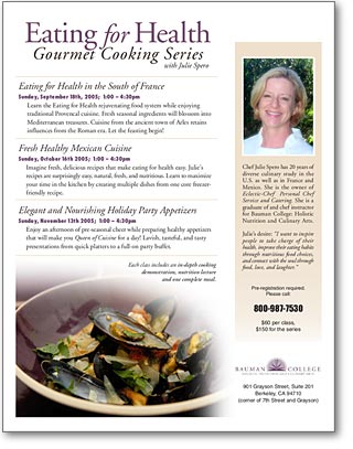
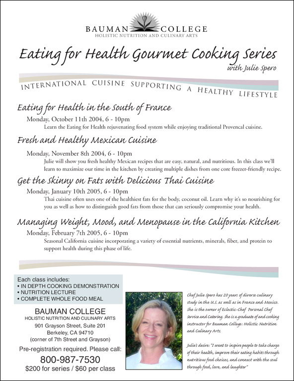
 Inspired by the incredibly useful Before and After magazine, I decided to re-design a flyer for a friend. The old flyer seemed rather bland to me. It didn’t say enough about Chef Julie’s awesome cooking skills, and it placed her image at the bottom of the page, like an afterthought.
The new flyer adds a bit of color, includes a photo of actual food prepared by Chef Julie and places her in a more prominent position on the page. I like the new flyer design quite a bit more than the old one. I’m happy to report that Julie’s pleased with the results, too. 🙂 What do you think?
Stay tuned for the latest flyer with Chef Julie’s new class schedule, and, hopefully, a new brochure!
Very clean Dude… as usual.
Very nice! Isn’t amazing that 10-15 years ago, something like this was only available through a profession printing company? You’ve given me a idea for something I’m working on. Thanks. Cindy
Pure genius – I never looked so good!
signed,
the chef 🙂