You can learn a lot about the process of designing a logo by tracing one.
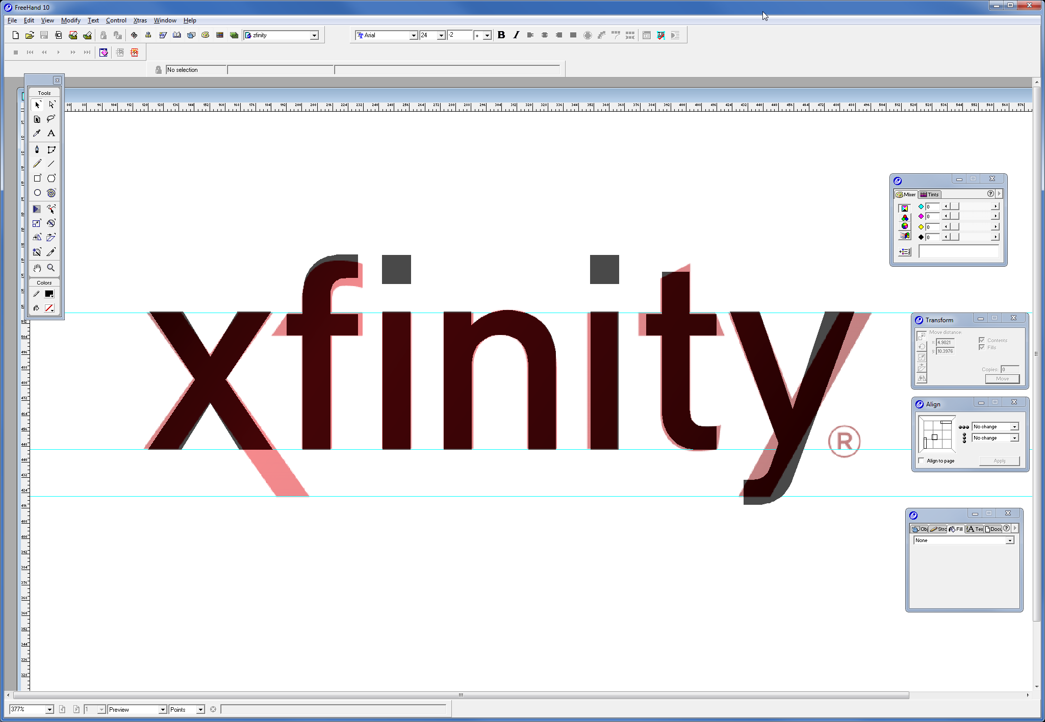
The design appears to be based on the ubiquitous DIN typeface – so popular it has its own web site. Simple tweaks were made to every character but the “n”, and the dots were dropped. You can see the minor changes in this screenshot. I can’t find anything on the web to indicate how much this identity change cost, but I’m sure the number is staggering. I think I’m in the wrong business.