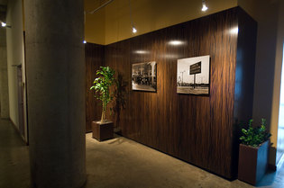
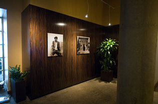
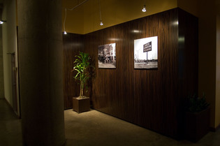
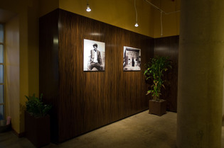
Our association recently insalled Macassar ebony wood paneling in our lobby, and although the results are striking, the overall effect is a bit darker than we’d imagined. To brighten things up just a bit, we’ll be hanging some sepia-toned reproductions of four archival images that previously hung elsewhere in the building. Before we go through the expense of printing and mounting the large prints, I used PhotoShop’s fantastic Vanashing Point filter to create these realistic visualizations.
Let’s see how these images compare to the finished installation.
Here are the results. The hand-held time-exposures are a bit blurry, but you get the idea. Looks like I hung the images a little higher than in the visualization. I may need to move them down! I think they look better lower on the walls.


Geez, what posesssed them to install that paneling? Yikes…looks like a doctor’s office…:-(
Yes I agree with Wendy, my Proctologist’s walls look similar.
Yes, It’s the last thing you see before you hear the phrase “You may feel some pressure …”
Yeah, or as we gals enjoy hearing, “SLIDE DOWN!”
LOL