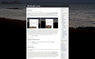
I really wish I could take credit for the redesign idea, but it was the always inspirational Before and After Magazine that made me do it. The latest issue contains a story about this attractive site. What peaked my interest is that this design clearly rewards people with a lot of screen real estate. My friends with 24″ displays and Opera are gonna see exactly what I mean. Now would be a good time to press F11, Grant, Orlando.
 I’m planning to use one image a month from my site as a 1920 pixel wide background. I already have two or three additional backgrounds mocked-up. With a nifty PhotoShop template, (9 megabyte .psd file) and sed, it’s simple to create them and to swap them out of my blog. There are three pieces, the background, a higher resolution header JPEG (to preserve the look of the font) and a GIF footer.
Hope you like it!
Excellent Smithers!
sed?! What a nerd 😉