After working on a few of my images, I confirmed what I already suspected. Yosemite looks better in black and white. The reason for this, as Mr. Adams clearly knew, is that you can make much larger image adjustments without destroying the image. The color image below was enhanced as much as I can stand. Adjusting things further would result in an obviously manipulated image.
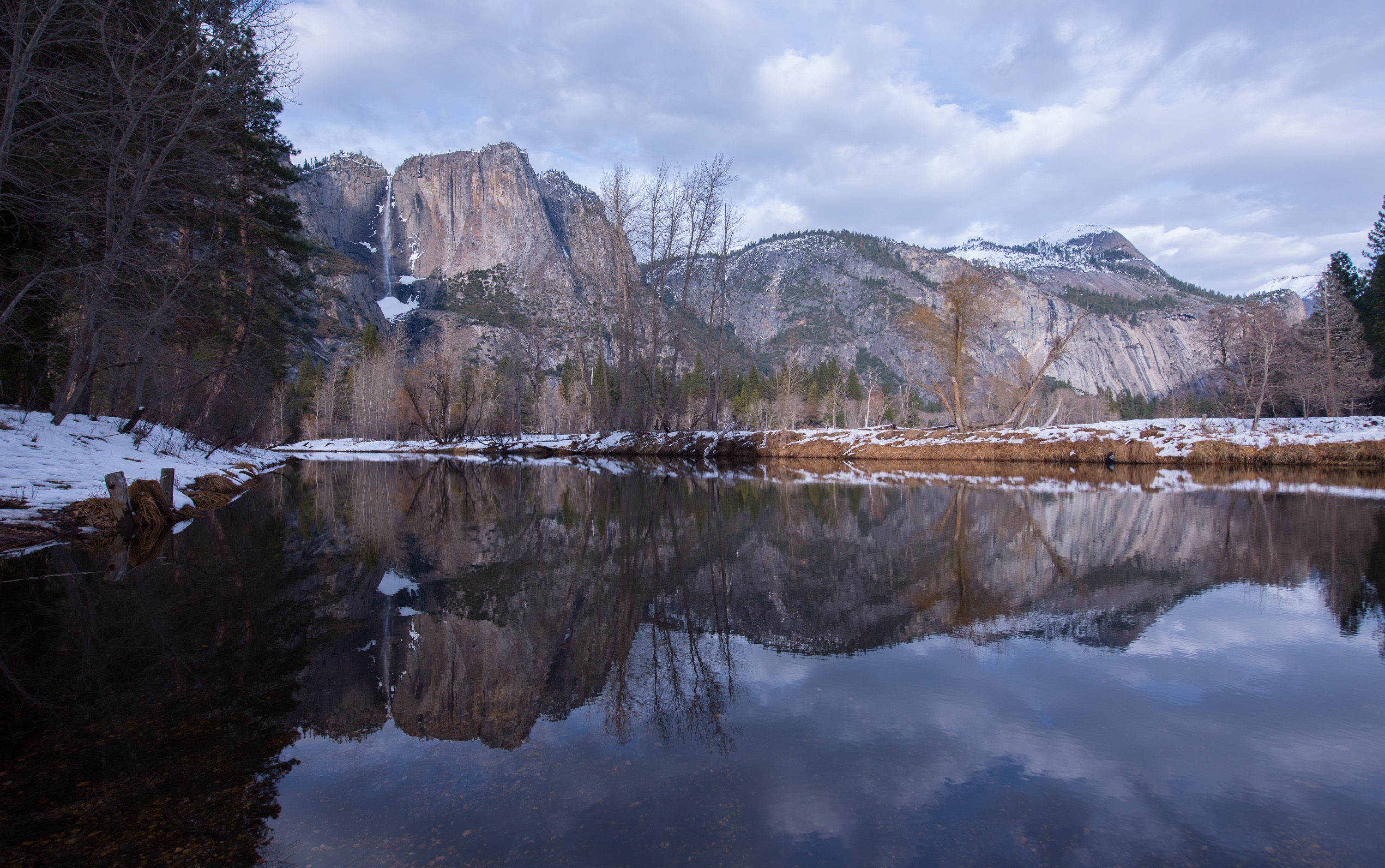
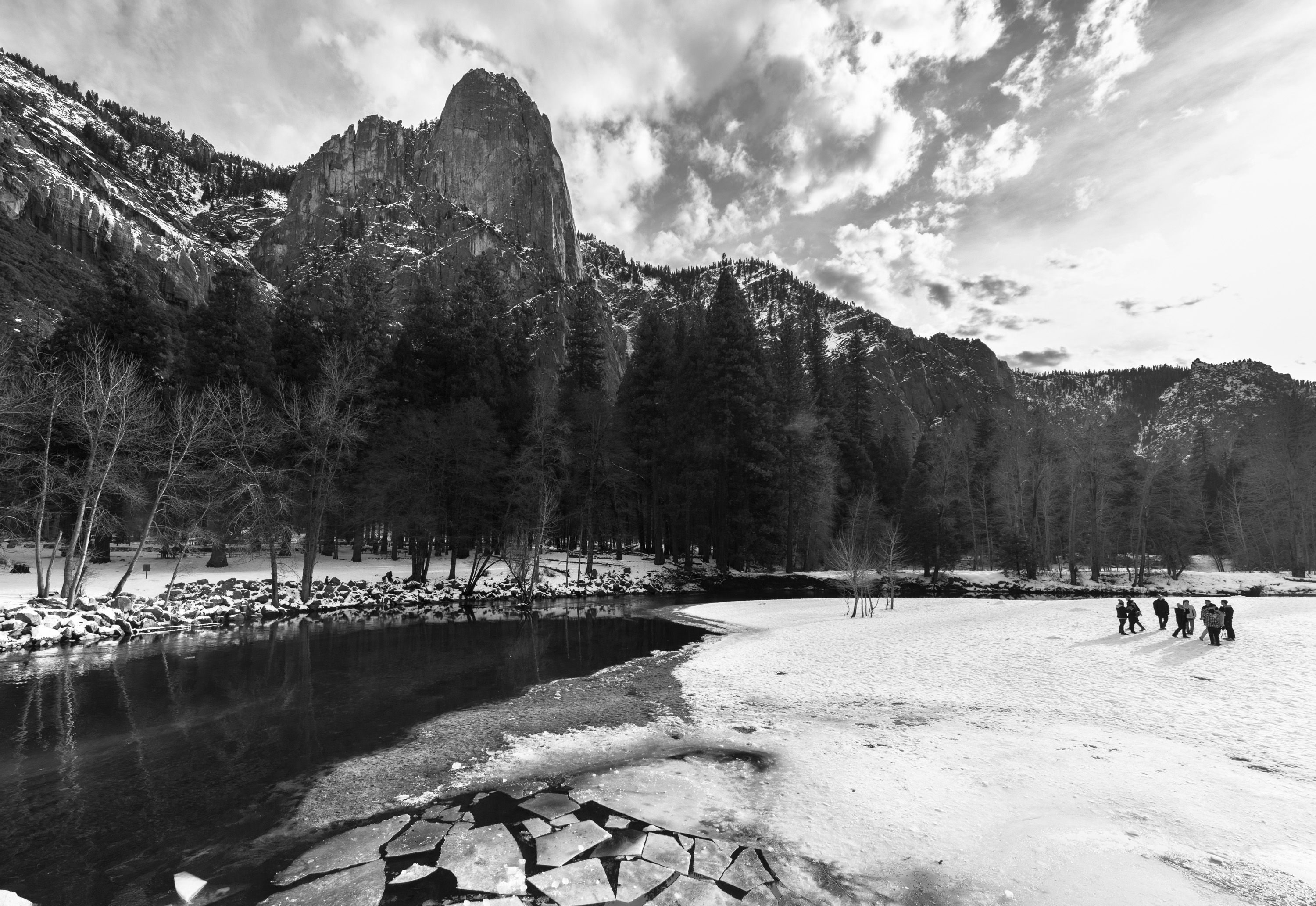
Now, the black and white version.
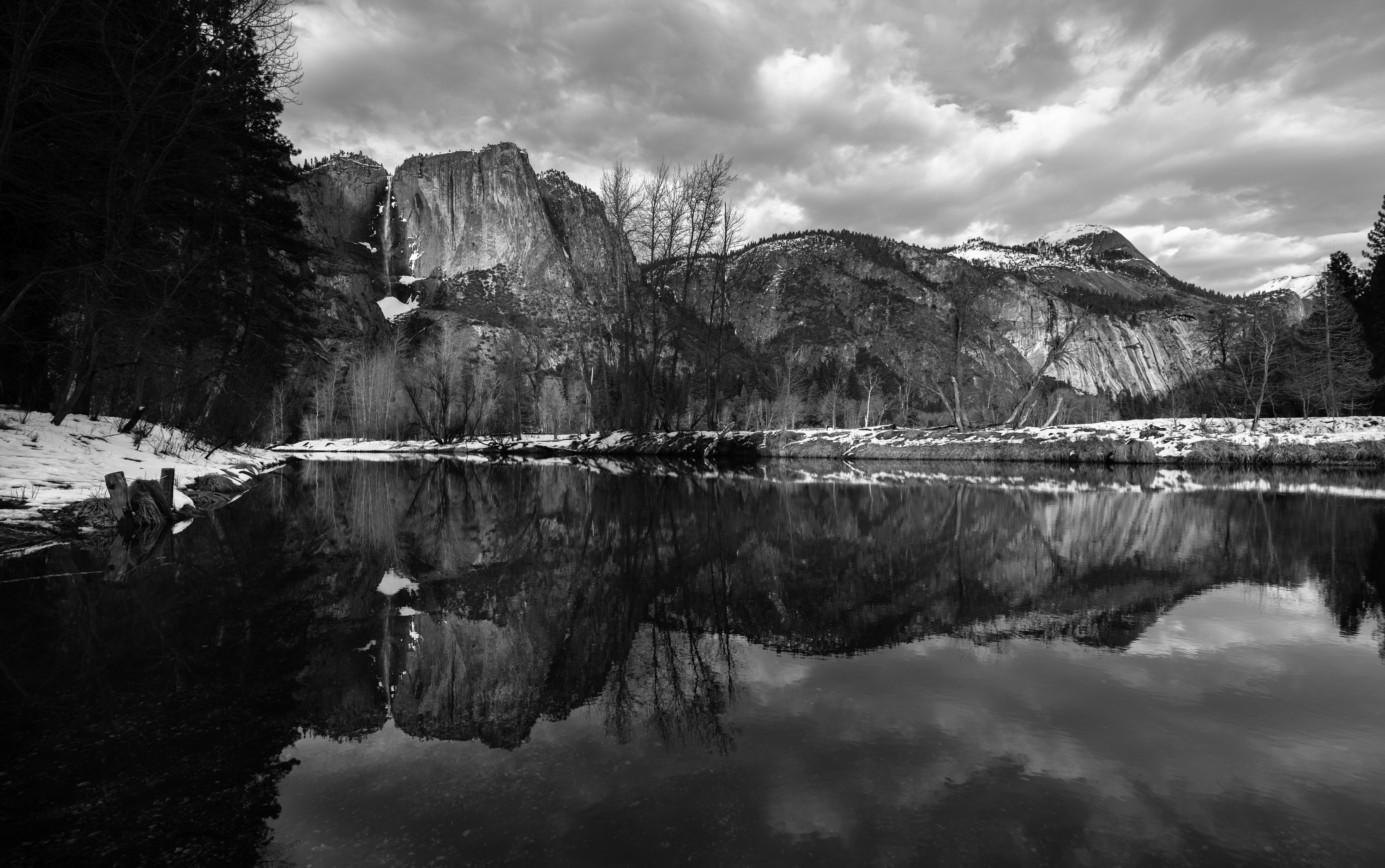
You can see the difference in the sky immediately. I made a few more adjustments to the contrast and some shadow detail here and there. These things were not really possible in the color image.
Xcellent
The top color photo is gorgeous, it will be my new wallpaper soon! 🙂 Black and white is lovely too but it has a completely different feel. 🙂
I have it as my wallpaper already!!!!!
Beeeeeyutiful!