Recently I have been toying with the idea of buying a color printer. Epson and HP make some fine printers that offer superior quality to any traditional printing methods. I’m pretty picky about my images, and thought that this would be the cheapest way to share prints of my favorite images with friends and family. I was wrong.
I worked the numbers and found that large-ish prints of my images would cost 5 to 7 bucks per page and consume a LOT of my valuable time. I looked for alternatives, and eventually decided to give MyPublisher.com a try. So, I pulled together 20 random images on Saturday afternoon and layed out my first photo book. I wanted to see the best they had to offer, so I ordered a Deluxe Hardcover book. 70 bucks for 20 large images bound together seems pretty reasonable, I thought. Still, my expectations were low. I knew that the CMYK printing process has inherent shortcomings, I expected the colors to be flat, I didn’t expect the paper to be heavy enough or have a nice enough coating, etc. I thought that the results might be OK, but certainly did not expect them to be great.
Laying out the book was simple. The easy-to-use software offers 15 different page layouts, including a full-bleed single-image-per-page format. This format is the most important to me, because it means I can use my favorite layout tools to create individual pages and export those pages as perfectly sized single images. I can place pictures and text anywhere I want and use any typeface I choose.


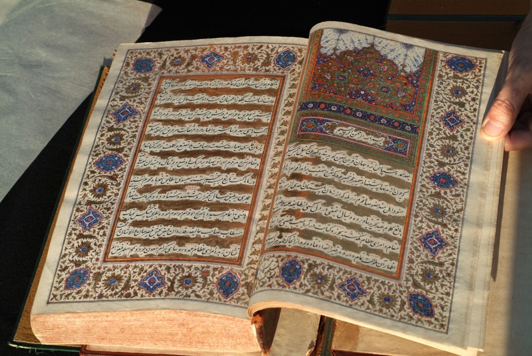
Well, the results blew me away. There are so many things to like about this book! The color and clarity are both excellent. Whites are bright, blacks are smooth and solid, flesh-tones near perfect. The binding is also perfect, (pun intended) the paper is sturdy and has a lustrous coating. This book looks totally professional. It’s way better than “good enough”.
On the negative side, laying out whole pages – with text embedded in the page-size image – has some limitations. This seems to be because the images display tiny compression artifacts where the “real” text does not. The closeup of the text above looks far worse than it does “in person”. In fact, the artifacts are barely noticeable, but they can cause text-as-part-of-an-image to look a bit soft. I may be able to reduce this problem by laying text on a 10% gray background. We’ll see when I order my next book from MyPublisher.com!
Highly recommended!
Jim, someone else had told me about this a few weeks ago and I had sort of forgotten to go check it out. VERY COOL! You should put together a collection of your Jack London District photos and sell it. I know I’d buy it. Even if you just did the paperback version and sold it for $20, I think quite a few people would buy it. In fact, how about JLM pay for 5 and give them away at Trash Bash?!
Wow, that is way cool! But you know dude, you’ll need about 97 of those books for ALL the Kelly photos you have….:-)
-Wendage