I saw this very poorly PhotoShopped image in one of our product brochures, and saw so many problems with it that I just HAD to do a better version. This is just a mockup right now, but I’d say it looks a bit more real, right??
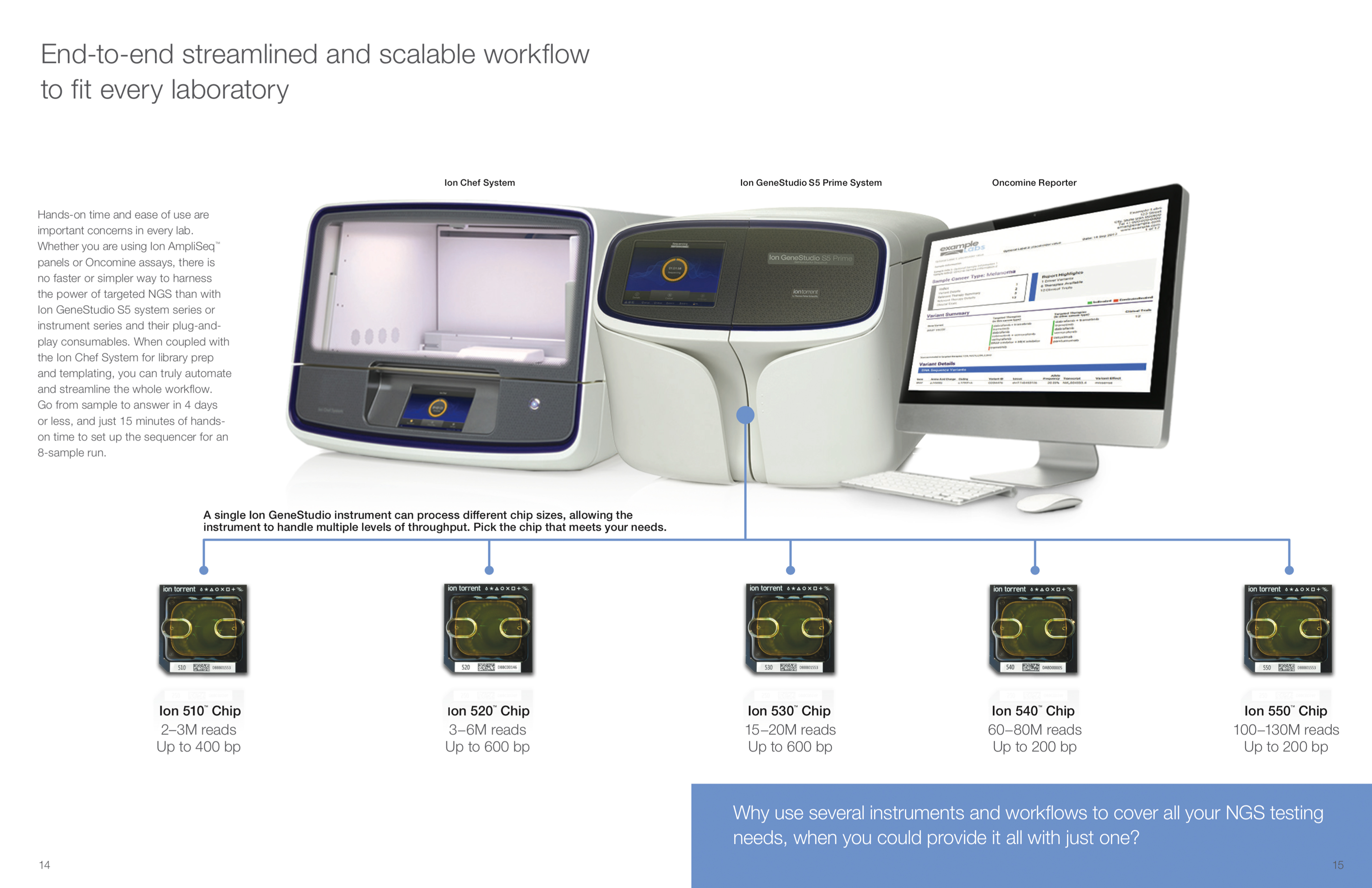
Here is the BEFORE
…and the AFTER
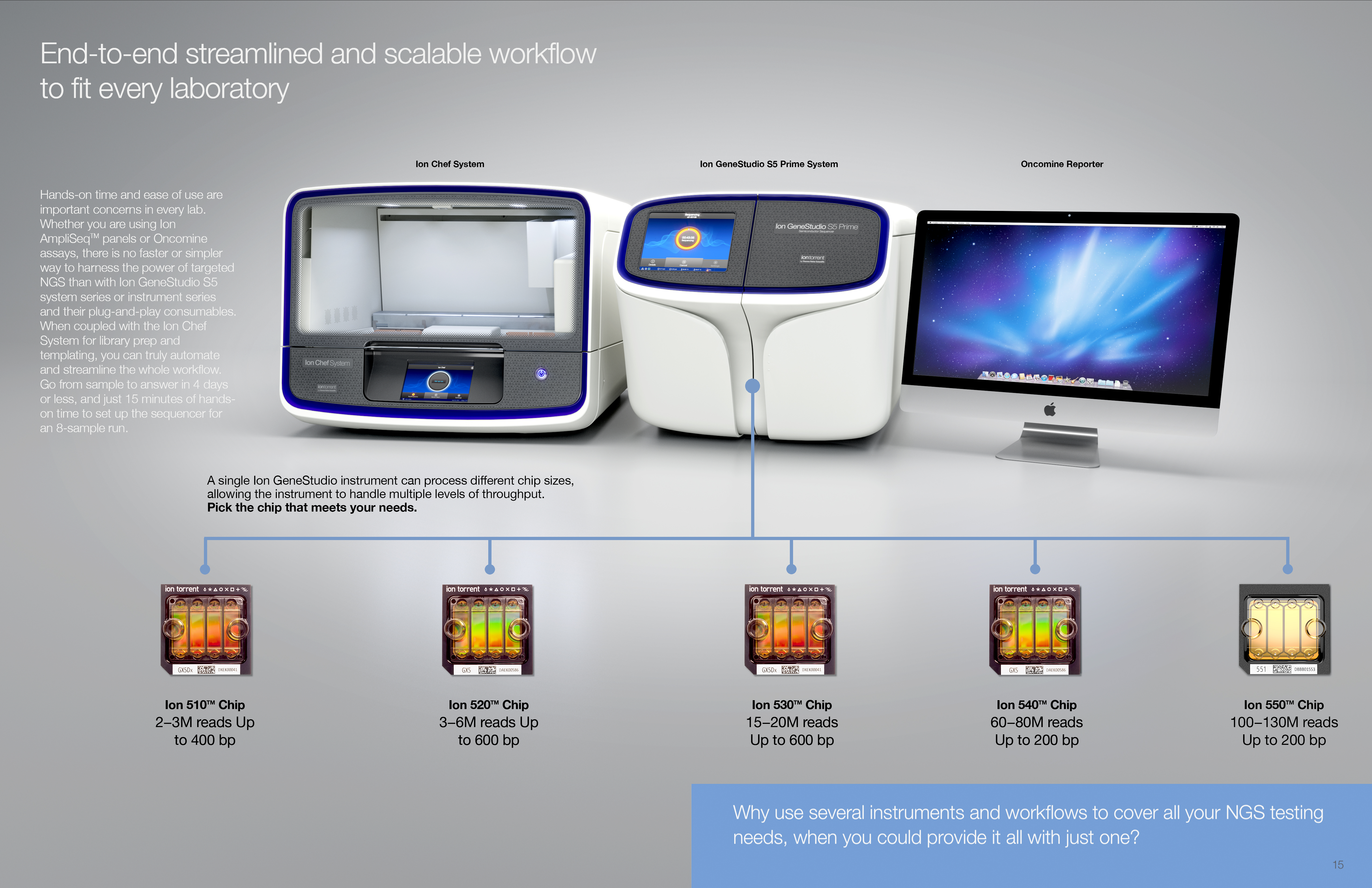
Are the chips on the bottom ones you made? Did you make all these and someone photoshopped them? I just make my opinion in my comments. Yes, yours looks way better. A touch too vibrant though. Neither pic looks real. I’m not sure why. Maybe because they are just clips instead of a whole pic?
I noticed the different angles right away. That drives me nuts.
I like this one. Couldn’t the units in back be a little less blurry?
Of course. It would depend on the size the ad would be used. If it’s smaller, the blur is less pronounced.
See how the thumbnail appears to have almost no blur? This effect is very size-dependent.
Yes but I would like even a little less.
I like this one.
I like this one best now too!